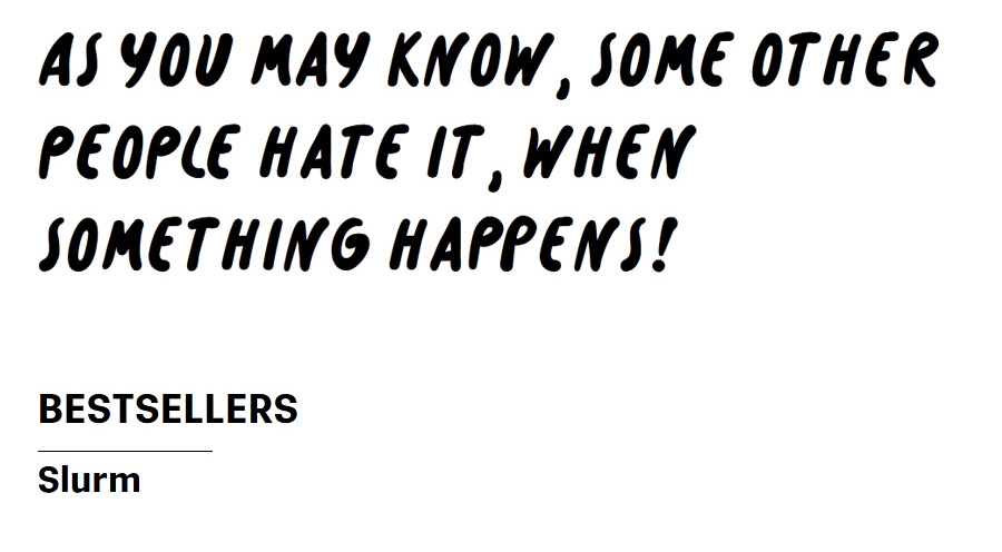
Slurm / Interview with Nikola Klímová
Posted By edition lidu Published In Interviews Created Date 2014-09-11 Views 9364
facebook twitter pinterest google plus email share

Nikola Klímová is a young and versatile graphic designer, actually studying at the Academy of Arts Architecture and Design in Prague. Her author's book My Holidays Lonely Monsters was shortlisted in Art Books Wanted International Award in 2013, her collection of book covers was selected to Bienale Brno and her book 1116 grams is a hot candidate of the ABW Award International 2014.

We had also the plesure to work with Nikola on various book and design projects as she was offered the internship at edition lidu. Nikola focus mainly on creating handwritten typography. We have asked her about her new Font Slurm that is part of the Bestsellers project.


About Slurm with Nikola Klímová

What does the name Slurm mean? Why did you decide to use it?

Slurm is popular soda / soft drink from TV show Futurama. It's slimy and highly addictive - same as my typeface. During creation of the font, the name is not important. I choose the name at the end just because it fits.


You have created the fisrt version of your font as a part of the book Soul by Tereza Vostradovská during your internship at edition lidu. When did you decided to create a whole font?

It was challenging to do the lettering for the Soul book. It's not easy to add something to other's people illustration. But the idea to do a complete alphabet came later while working on a school project. We had a semester-long assignment in the studio of Type Design and Typography. It's called "Bestsellers" - our goal was to create our own typeface based on the latest trends. Hand-written fonts is one category that is doing very well these day.
So font created for the book Soul turned out to be pretty good starting point. By the way you can see all the typefaces from this project in September in Czechdesign gallery in Prague.


What was the first inspiration?

Nothing specific. I tried to create font with simple, bold shapes and big range of usability.


For what type of products is your font the most suitable?

Comic books, titles, logotypes, product design, etc.


What are the greatest advantages of your font?

My typeface includes two basic styles including all accents for Latin alphabet. Each character is original which supports credibility of hand-written style of the font. Slurm even includes set of pictures for more fun while using it.


You use a skull instead of some letters. Why?

Because skull is cool.
It is also an example of additional use of my typeface. Pictures that you can use instead words or letters.


In what language do you think the font looks the best?

In English. Most of the typefaces look better in english. Words and sentences are not disrupted by accents and by that whole lines and pages looks more balanced.

Interview by Klára Kvitová for edition lidu


You can test and buy the Slurm font by Nikola Klímová on MyFonts
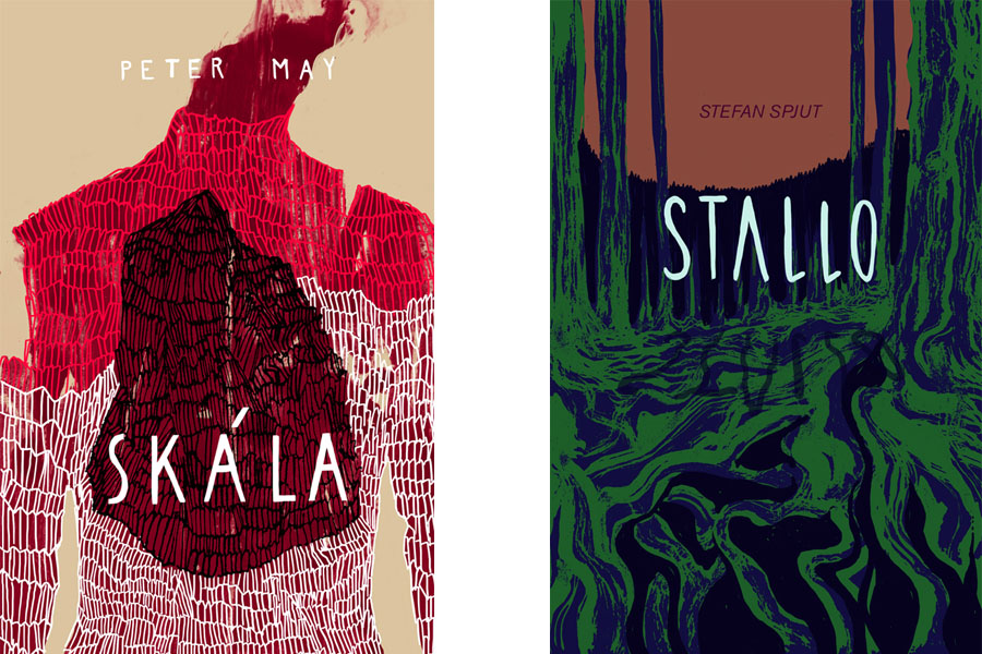
 

Cover design by Nikola Klímová
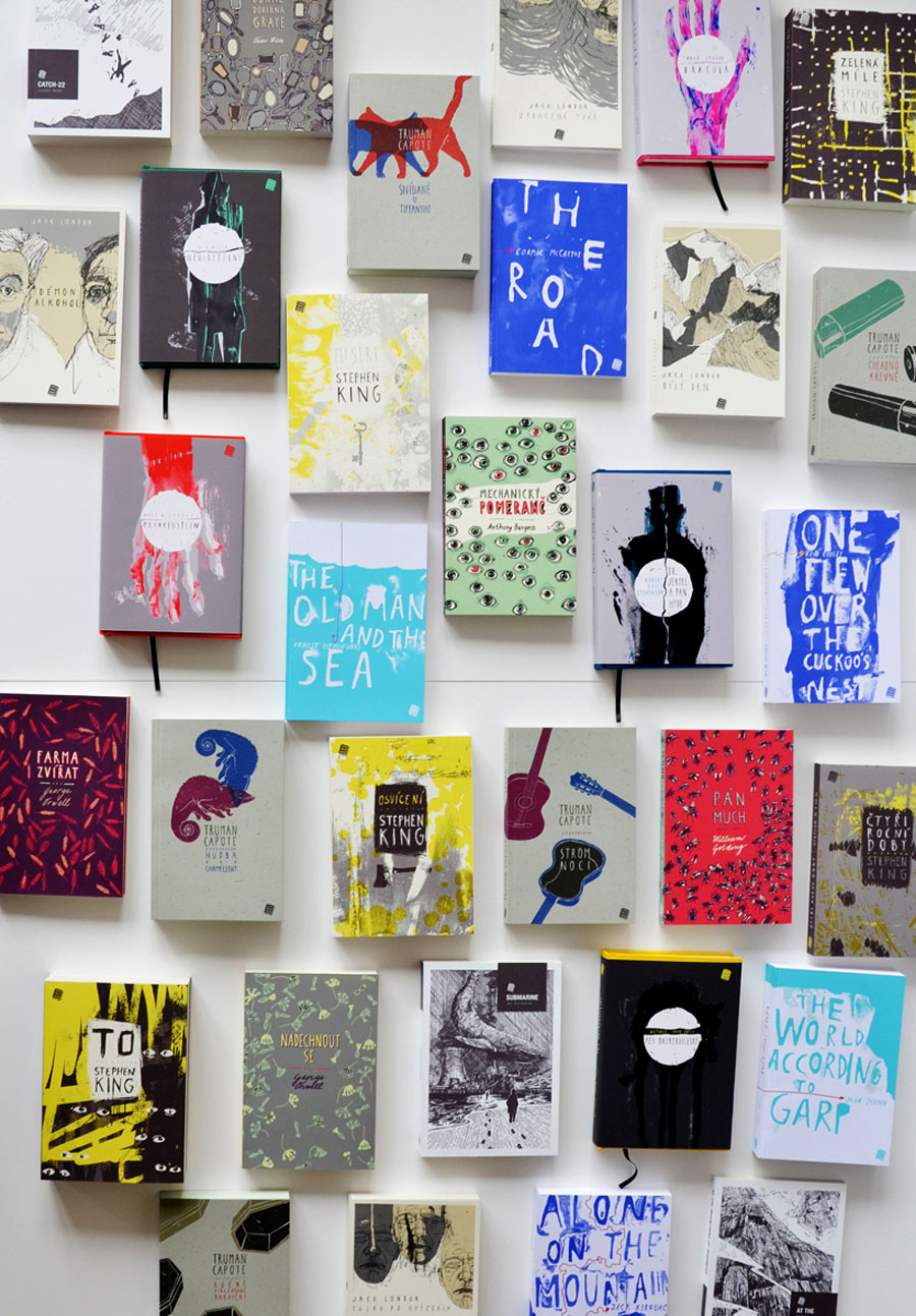
Collection of Book covers designed by Nikola Klímová
Photo credits: Archive of Nikola Klímová

What do you think?
What People Read the Most
For the occassion of Milan Design Week 2014 and MICRO Festival of independent publishing, edition lidu organizes a creative workshop: The World's Long...
Activity Book for Massaging Imagination by Catarina Gomes featured in new SOFFA 11. SOFFA, European bi-monthly design and lifestyle magazine founded i...
Have you ever dreamt about being a writer or illustrator, while drawing a princess image as a little kid to your mama? Well, who haven’t? Fortunately,...
Prague Design and Fashion Week 2014 also known as Designblok was held from 7th till 12th October 2014 and offered an extensive design program located ...
PechaKucha Night, now in over 700 cities, was devised in Tokyo in February 2003 as an event for young designers to meet, network, and show their work ...
Nikola Klímová is a young and versatile graphic designer, actually studying at the Academy of Arts Architecture and Design in Prague. Her author's boo...
Scrollino is the new original book form and editorial concept offering a playful experience to all book and design lovers. You just need your regular ...
The Catch d'écriture - art battle of French writers in Mexican style was definitely edition lidu's most punk event ever, we enjoyed it so much!!!!! We...
EDITION LIDU has been invited by the Bibliotheque HERMELAND to create a SCROLLINO LIVE PRINTED PERFORMANCE for the occasion of the French national eve...
Scrollino® was officially launched in Italy during the Milano Design Week 2017 - the most important design event in the world. Designers, art director...
We would like to cordially invite you to upcoming events in December, where you can discover Scrollino. Scrollino will be on sale at 2 design events i...
The International Scrollino Launch Tour by edition lidu beggins right now! Starting at the Brussels Comic Strip Festival on 2nd Septembre 2016. After ...
Our Scrollino International Launch Tour started on 2nd September 2016 at the Brussels Comic Strip Festival (Fête de la BD). Ludmila & Sylvain Fava...
Scrollino goes to Milano Design Week 2017! Yey! We are very excited and happy to collaborate with On Printed Paper to present Scrollino exhibition at ...
edition lidu's Best Picks